Here’s a geography lesson and could come in handy as a party trick…
I’m still coming to understand that there are different ways to represent the earth on a map or in an atlas. There’s a number of different map projections, with the main ones we’re familair with being the Mercator and the Gall-Peters projections. Whereas the Mercator was useful for navigation, the Gall-Peters attempts to give a more realistic/accurate idea of the real size of countries. “The Mercator projection increasingly inflates the sizes of regions according to their distance from the equator. This inflation results, for example, in a representation of Greenland that is larger than Africa, whereas in reality Africa is 14 times as large.” (http://en.wikipedia.org/wiki/Peters_map)
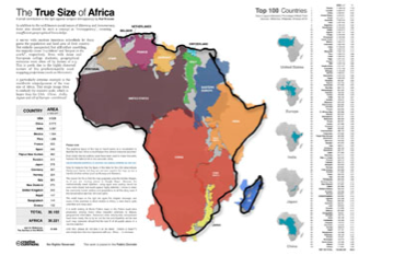
Africa is the second largest continent after Asia and to give an indication of its size (and to give a better sense of what this means), Greg Ousuri has created a map which shows that the U.S., all of Europe, China and Japan still don’t fill up the entire surface area of the continent. Amazing! Is it true/accurate?

I wonder what other countries you could fit in if you started with Australia…?
